 ReddRadar

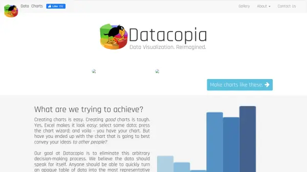
What is Datacopia?
Datacopia is a user-friendly web-based tool designed to simplify the process of creating charts and graphs from raw data. By supporting a range of popular visualization types such as bar, pie, line, time series, scatter charts, word clouds, and geo maps, Datacopia helps users transform complex datasets into clear, insightful visuals with minimal effort.
This platform eliminates the need for manual spreadsheet manipulation by automating chart generation. Datacopia empowers users to focus on interpreting and understanding their data, making it an ideal solution for enhancing productivity in both professional and educational settings.
Features
- Automated Visualization: Instantly generate charts and graphs from raw data
- Multiple Chart Types: Supports bar, pie, line, time series, scatter charts, word clouds, and geo maps
- User-Friendly Interface: Designed for ease of use without requiring advanced technical skills
- Enhanced Data Understanding: Focuses on helping users interpret and analyze their data quickly
Use Cases
- Creating visual reports from spreadsheet data
- Presenting complex data sets in an understandable format
- Generating graphs for presentations and meetings
- Building word clouds and geo maps for research or marketing insights
- Streamlining data analysis for business intelligence
Helpful for people in the following professions

Featured Tools
Join Our Newsletter
Stay updated with the latest AI tools, news, and offers by subscribing to our weekly newsletter.